Capturing No Exit
posted by Nina Fujikawa, Graphic Designer
How do you get people to see a show? This question, like it or not, lies at the heart of the theatrical creative process. Theater can’t exist without an audience. And as much as we who make live theater like to grumble about the lengths we have to go to to attract patrons, there’s a lot to be learned from asking: What is this show about, and why would someone want to see it? In this visual post, A.C.T. Graphic Designer Nina Fujikawa gives us a glimpse of what it’s like to distill an hour-and-a-half theatrical experience into a one-page poster that expresses the essence of The Virtual Stage and Electric Company Theatre’s live-cinema interpretation of Sartre’s existential classic No Exit.
—The A.C.T. Intern Blog Quadrumvirate
No Exit opens at A.C.T. this week, the culmination of a many-months-long (years for some) creative process that I, in a very small but visible way, got to be a part of. I was charged with creating the show art for the U.S. debut of this voyeuristically re-imagined production from Vancouver, Canada.
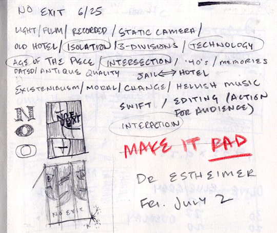
My part in the process began months ago in a team meeting with Kim Collier, the director of the production. I took lots of notes, and from those notes certain “creative drivers” began to pop off the page. These words drove the conceptual process, providing inspiration and point of direction.
Fortunately for me, No Exit also came with some pretty stunning photography from previous productions, which provided another great source of inspiration.

Now the fun part: getting visual ideas down on paper. Once I’ve got a good slew of thumbnail sketches to work with (or once I start drawing the same thing over and over again), I move to the computer to flush out three concepts.

Concept one was rooted in the show’s cinematic storytelling style. The moody, film noir look speaks to the emotional and psychological drama of the play.

Concept two subtly evoked the mystery and historical period of the piece (mid 1940s), while showcasing the striking photography from the Vancouver production. You could also say this was the keep-the-cat-in-the-bag option—not giving away the technical “live-cinematic” aspect of the production.

Concept three came directly from those early creative drivers of division, intersection, and interaction. After a design presentation, this concept got the green light from Janette Andrawes, A.C.T.’s marketing director, and was approved by the show’s Canadian producers.


After the three-sheet (a very large poster displayed in front of the theater for each show) is complete, the artwork gets adapted for various formats and sizes. This “business end” of the process is less exciting because it’s more technical and less creative (at a certain point we briefly joked there was no exit from No Exit), but the satisfaction of seeing the final product is well worth the time spent with spec sheets and measuring margins.


How do you get people to see a show? This question, like it or not, lies at the heart of the theatrical creative process. Theater can’t exist without an audience. And as much as we who make live theater like to grumble about the lengths we have to go to to attract patrons, there’s a lot to be learned from asking: What is this show about, and why would someone want to see it? In this visual post, A.C.T. Graphic Designer Nina Fujikawa gives us a glimpse of what it’s like to distill an hour-and-a-half theatrical experience into a one-page poster that expresses the essence of The Virtual Stage and Electric Company Theatre’s live-cinema interpretation of Sartre’s existential classic No Exit.
—The A.C.T. Intern Blog Quadrumvirate
No Exit opens at A.C.T. this week, the culmination of a many-months-long (years for some) creative process that I, in a very small but visible way, got to be a part of. I was charged with creating the show art for the U.S. debut of this voyeuristically re-imagined production from Vancouver, Canada.
My part in the process began months ago in a team meeting with Kim Collier, the director of the production. I took lots of notes, and from those notes certain “creative drivers” began to pop off the page. These words drove the conceptual process, providing inspiration and point of direction.
Fortunately for me, No Exit also came with some pretty stunning photography from previous productions, which provided another great source of inspiration.
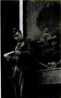
On screen: Andy Thompson and Laara Sadiq. Onstage: Jonathon Young. Photo by Michael Julian Berz.
Now the fun part: getting visual ideas down on paper. Once I’ve got a good slew of thumbnail sketches to work with (or once I start drawing the same thing over and over again), I move to the computer to flush out three concepts.
A sample from Nina’s sketchbook
Concept one was rooted in the show’s cinematic storytelling style. The moody, film noir look speaks to the emotional and psychological drama of the play.
Initially, the idea was to create a series of posters featuring each of Sartre’s three
hell-bound characters and display them as a triptych in front of the theater.
Ultimately, due to logistics, this idea was abandoned.
hell-bound characters and display them as a triptych in front of the theater.
Ultimately, due to logistics, this idea was abandoned.
Concept two subtly evoked the mystery and historical period of the piece (mid 1940s), while showcasing the striking photography from the Vancouver production. You could also say this was the keep-the-cat-in-the-bag option—not giving away the technical “live-cinematic” aspect of the production.
Concept three came directly from those early creative drivers of division, intersection, and interaction. After a design presentation, this concept got the green light from Janette Andrawes, A.C.T.’s marketing director, and was approved by the show’s Canadian producers.
The final three-sheet
After the three-sheet (a very large poster displayed in front of the theater for each show) is complete, the artwork gets adapted for various formats and sizes. This “business end” of the process is less exciting because it’s more technical and less creative (at a certain point we briefly joked there was no exit from No Exit), but the satisfaction of seeing the final product is well worth the time spent with spec sheets and measuring margins.
The No Exit three-sheet and 9x2 sign in front of the American Conservatory Theater
No Exit posters on an SF Muni train (left) and in a BART station

.jpg)